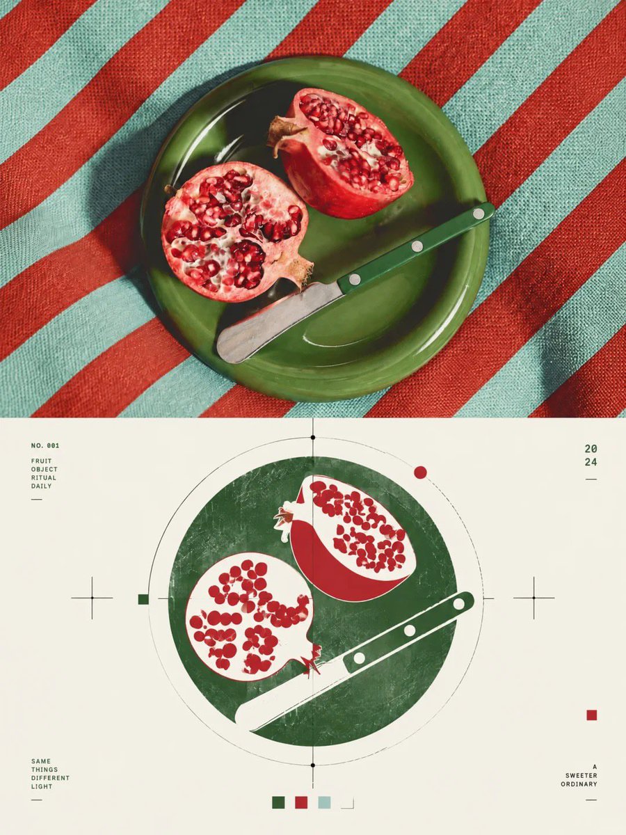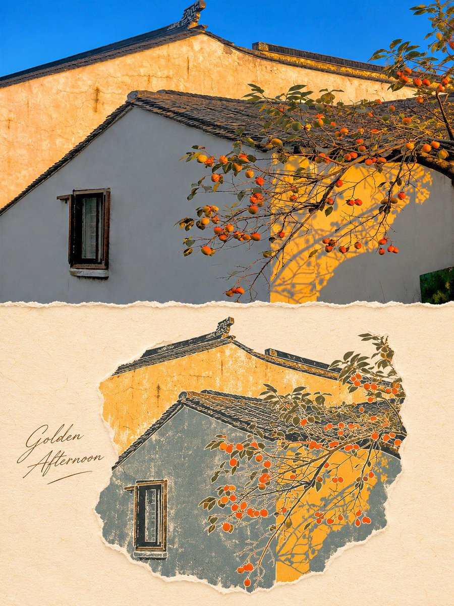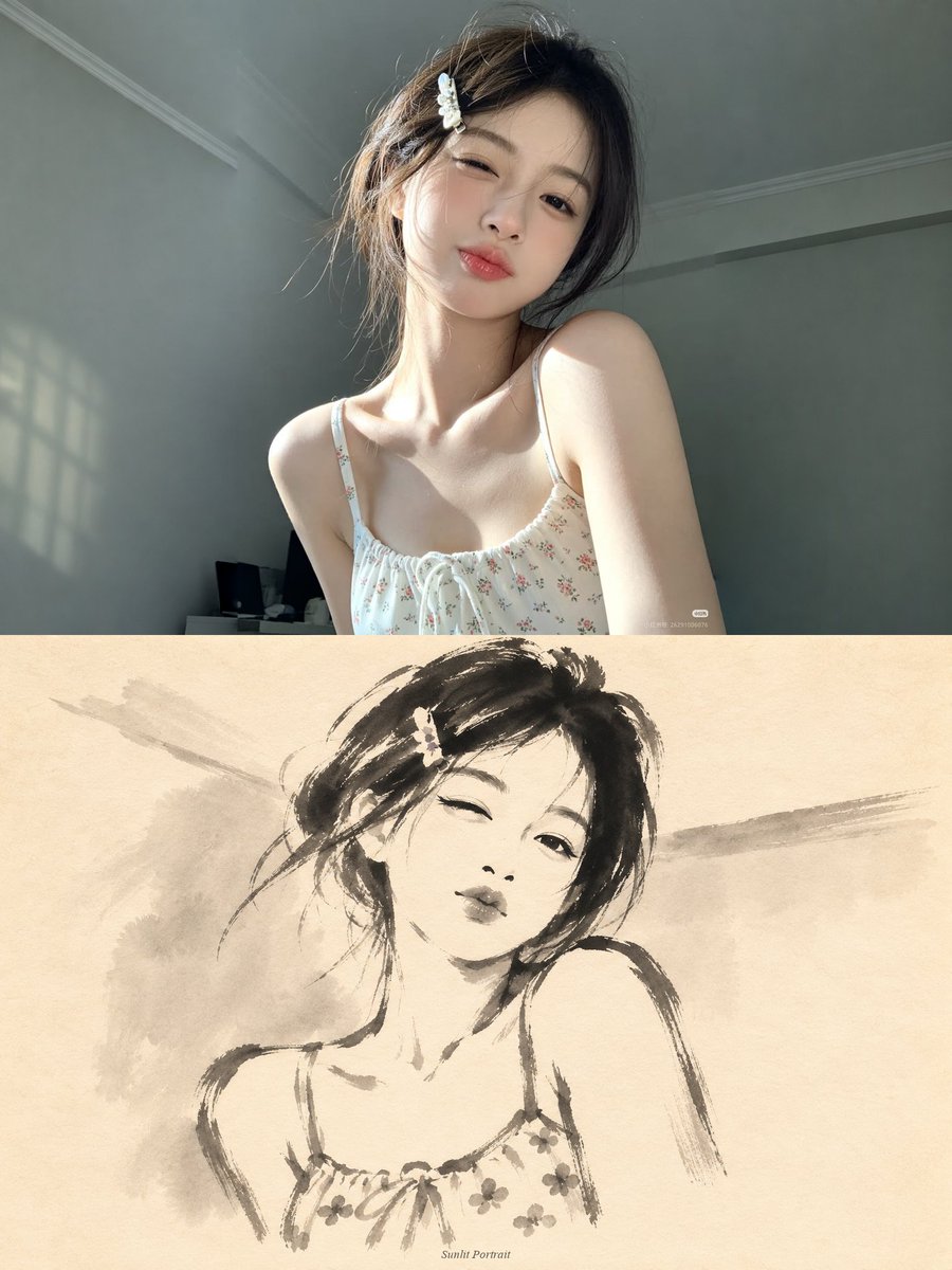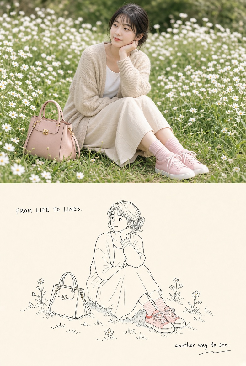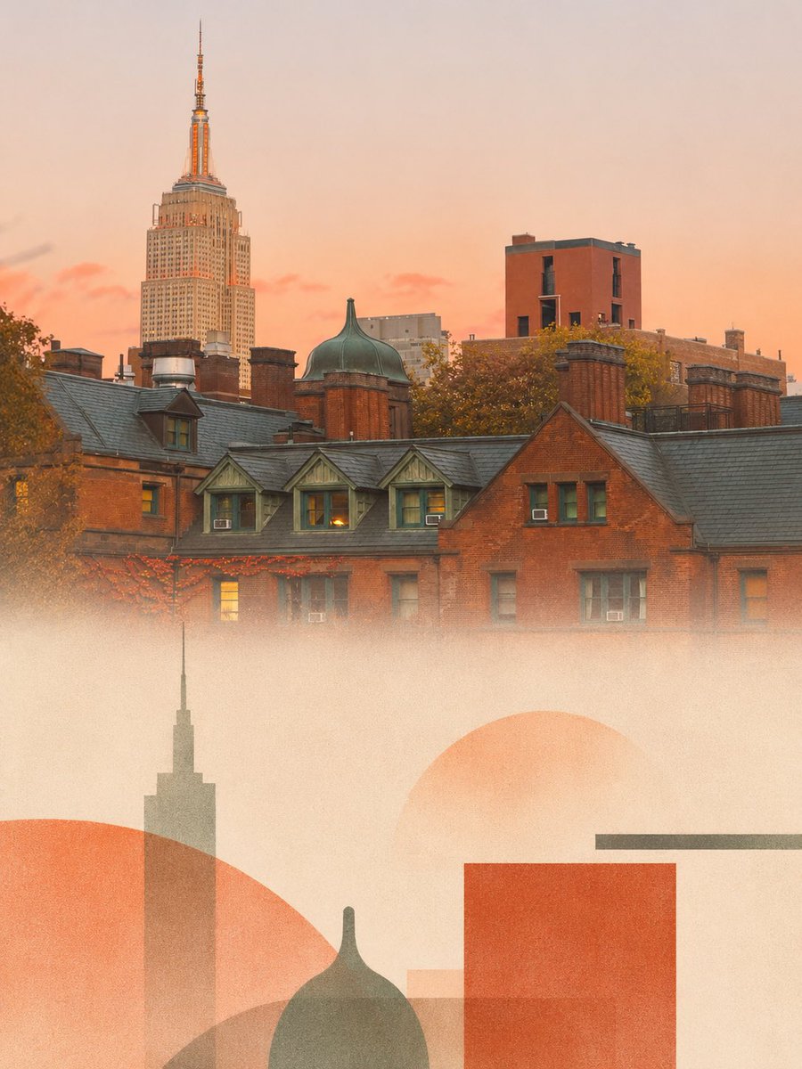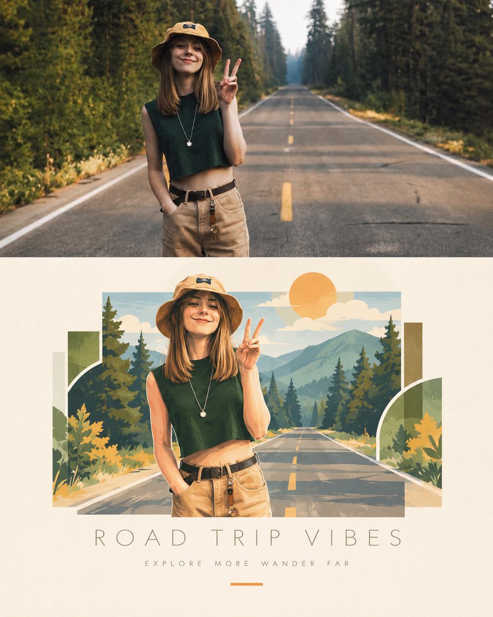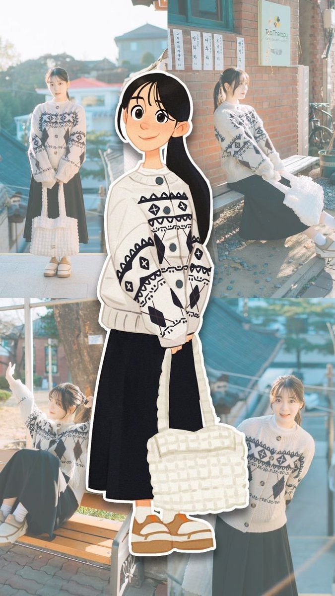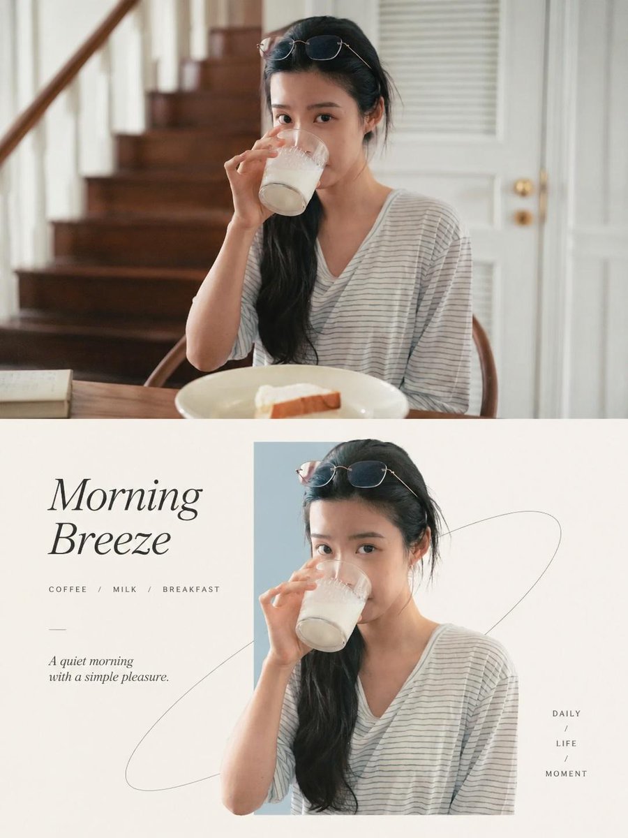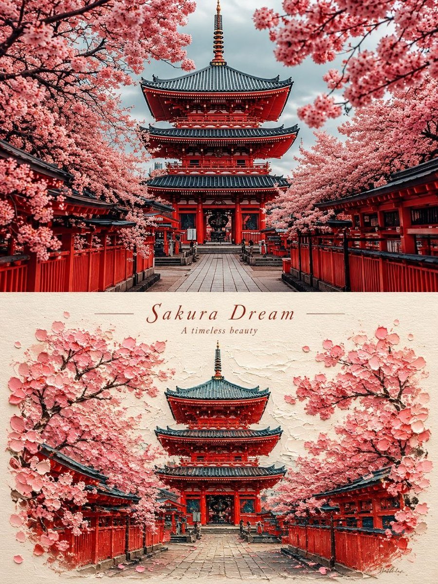
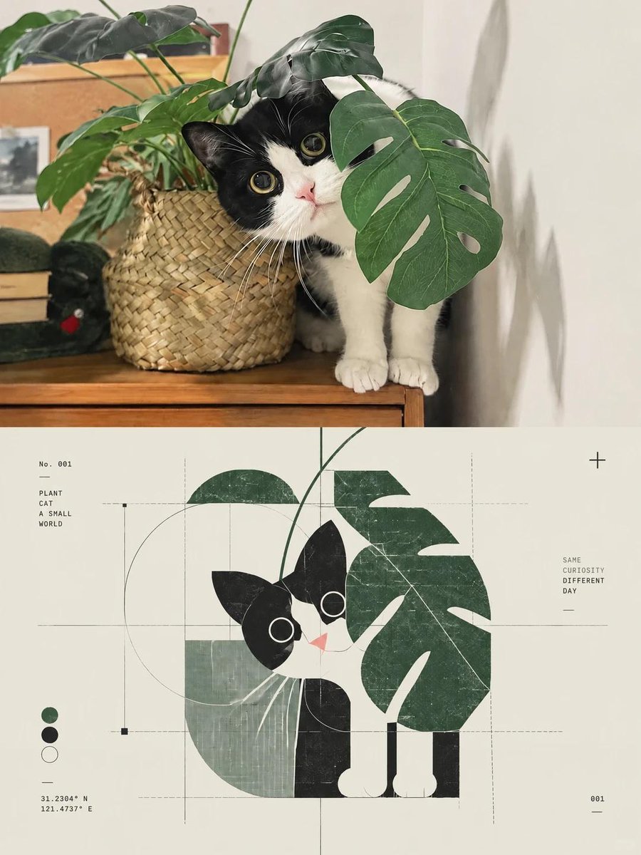
Transform the uploaded photograph into a standalone, premium 3:4 vertical design poster. 1. Overall Composition & Layout Divide the entire canvas into two perfectly equal horizontal sections: - Top 50%: Original photographic image. - Bottom 50%: Abstract visual identity derived from the core essence of the photograph. Maintain a precise 1:1 vertical division between the two sections. The final result should feel like a sophisticated art publication, experimental design poster, and high-end visual identity system. 2. Upper Section — Artistic Photography Preserve the original photograph's subject, composition, structural details, realistic textures, natural lighting, shadows, and authentic color atmosphere. Apply only subtle, sophisticated color grading to elevate the image into an editorial fine-art photography aesthetic. - Maintain the original subject's identity, proportions, pose, and physical characteristics. - Do not stretch, distort, reconstruct, or alter the subject. - Extend the background naturally if necessary to accommodate the 3:4 vertical composition. - Preserve the original photographic realism. - Avoid excessive retouching, artificial effects, or overly stylized color grading. The result should resemble premium editorial photography featured in an independent art and design publication. 3. Lower Section — Abstract Visual Identity Extract the photograph's essential visual DNA and translate it into an independent, abstract graphic symbol. Identify the most recognizable characteristics of the subject: - Silhouette and overall outline. - Structural geometry and distinctive forms. - Pose, movement, or spatial relationships. - Core narrative and emotional character. Do not recreate the complete subject or produce a literal illustration. Instead, reduce its defining characteristics into a minimal, recognizable abstract visual mark. Use: - Geometric deconstruction. - Modular shapes and structural blocks. - Precision linework and architectural geometry. - Negative space. - Symbolic forms and visual simplification. - Circular trajectories, grids, and abstract nodes. The final symbol should feel like the central identity mark of a high-end creative studio, experimental design label, architectural practice, or contemporary art institution. 4. Visual Design Language Explore a sophisticated combination of: - Post-digital graphic design. - Deconstructed Swiss design. - Generative symbol systems. - Diagrammatic abstraction. - Experimental editorial typography. - Contemporary visual identity design. Create a visual tension between: - Order and imperfection. - Precision and handmade irregularity. - Digital systems and analog aesthetics. - Rational geometry and emotional expression. Use geometric modules, delicate lines, circular arcs, subtle grids, micro-symbols, numbering systems, and abstract structural connections. Keep the composition extremely restrained. The abstract symbol must remain the single dominant visual focal point, positioned centrally or slightly off-center, surrounded by generous negative space. Avoid visual clutter, excessive decorative elements, multiple competing icons, or infographic-style layouts. 5. Typography & Micro-Details Typography should function only as a subtle component of the visual system, never as the main headline. Optionally incorporate: - Tiny serial numbers. - Minimal alphanumeric codes. - Short experimental annotations. - Small indexing labels. - Fine typographic markers. Use refined, minimalist typography with an archival, technical, experimental-publication aesthetic. Every typographic element should feel intentional and structurally connected to the abstract symbol. 6. Color System Extract the dominant and most distinctive colors directly from the original photograph. Reinterpret them as a coherent visual identity color palette. Use: - Warm white, off-white, or soft grey as the primary background. - Restrained accent colors such as teal, cyan, blue, magenta, or orange when supported by the original image. - Small, highly intentional color accents as functional visual codes. Color should communicate structure and identity rather than serve as decoration. Avoid chaotic color combinations, cheap neon effects, oversaturated palettes, and generic commercial gradients. 7. Print Texture & Material Treatment Introduce subtle physical imperfections to give the digital composition the tactile quality of a printed experimental art publication. Incorporate: - Xerox photocopy texture. - Risograph grain. - Subtle print registration misalignment. - Fine scanner noise. - Delicate paper grain. - Slightly imperfect edges. - Minimal analog printing artifacts. Keep these textures extremely subtle and controlled. They should enhance the material quality without compromising clarity, precision, or visual hierarchy. 8. Final Art Direction The final poster should communicate the feeling of a sophisticated, independent visual identity extracted directly from the original photograph. The upper half represents the original subject through authentic photography. The lower half represents its visual essence through an abstract, independently recognizable graphic identity. The two sections should feel conceptually connected while maintaining distinct visual languages. Creative references: Contemporary art institutions, experimental publishing, architectural identity systems, Swiss graphic design, independent creative studios, and high-end cultural branding. Final aesthetic: Minimal, intelligent, conceptual, architectural, editorial, tactile, and visually distinctive. Strict requirements: - Vertical 3:4 aspect ratio. - Exact 50% photographic / 50% abstract division. - Preserve the original photograph without distorting its subject. - One dominant abstract symbol in the lower half. - Generous negative space. - Sophisticated, restrained color palette. - Subtle physical print textures. - No unnecessary decorations, excessive text, or infographic layouts. The ultimate goal is to extract a unique visual DNA from the photograph and transform it into a self-contained abstract logo — a minimal, culturally resonant visual identity with its own character, memory, and design language.